The Dashboard page is displayed after the user logs into the system. This page serves as the central overview of all key operational and analytical data, including patient statistics, session activity, financial insights, and treatment progress.
It provides a structured and real-time summary of important metrics, enabling users to monitor performance, manage schedules, and make informed decisions efficiently.
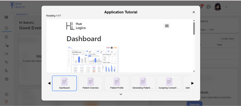
Tutorial Popup For New Users #
A tutorial popup is displayed for new users when they first access the dashboard.
Behavior: #
- Controlled using a
new_user_flag - Displayed only once for new users
This helps users understand dashboard functionality.
Initial State #
When the dashboard is loaded, the system fetches data from multiple backend APIs, including patient data, session data, and analytics summaries.
If the user is a demo user, the system displays predefined static data for visualization purposes.
If the user has a restricted subscription plan, certain advanced components (such as charts and analytics) showing “Upgrade Card”.
A loading indicator is displayed while data is being fetched.
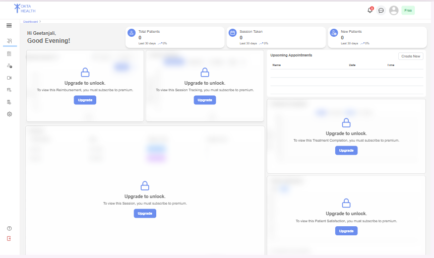
Greeting Section #
At the top of the dashboard, a personalized greeting is displayed.
This section includes:
- User’s first name
- Dynamic greeting message based on system time:
- Good Morning
- Good Afternoon
- Good Evening
This provides a personalized user experience.
Statistics Cards #
The dashboard displays key performance indicators using summary cards.
Displayed Metrics: #
- Total Patients
- Sessions Taken
- New Patients
Each card includes:
- Total count
- Last 30 days comparison
- Percentage increase or decrease
- Visual indicator (up/down arrow)
These cards provide a quick snapshot of system performance.
